Utility Payments
7/28/16
This article will be short and sweet!
I always appreciate it when statistics classes give real-life data instead of just "widgets", or something to that affect.
Here is some real-life data; our utility payments for roughly the last 5 years. There is a graph for electricity, natural gas, trash, and water.
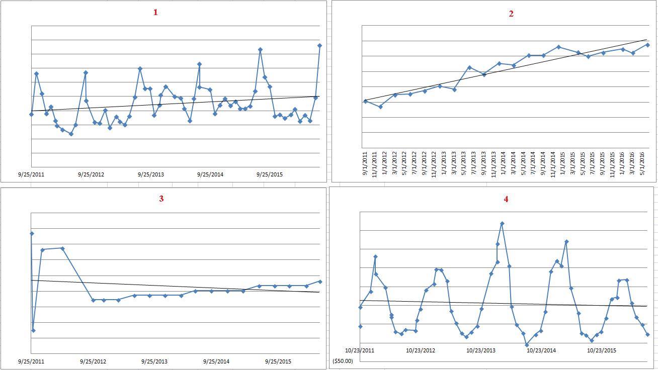
I've omitted the titles (obviously) and the dollar amounts. It is your task to reason which utility belongs to which graph.
From an investing standpoint, I personally may consider investing in those utilities which show an upward trend line.
Please anonymously VOTE on the content you have just read:
Like:Dislike: